Branding · Web
Nile Steel
Building the future with strength.

Overview
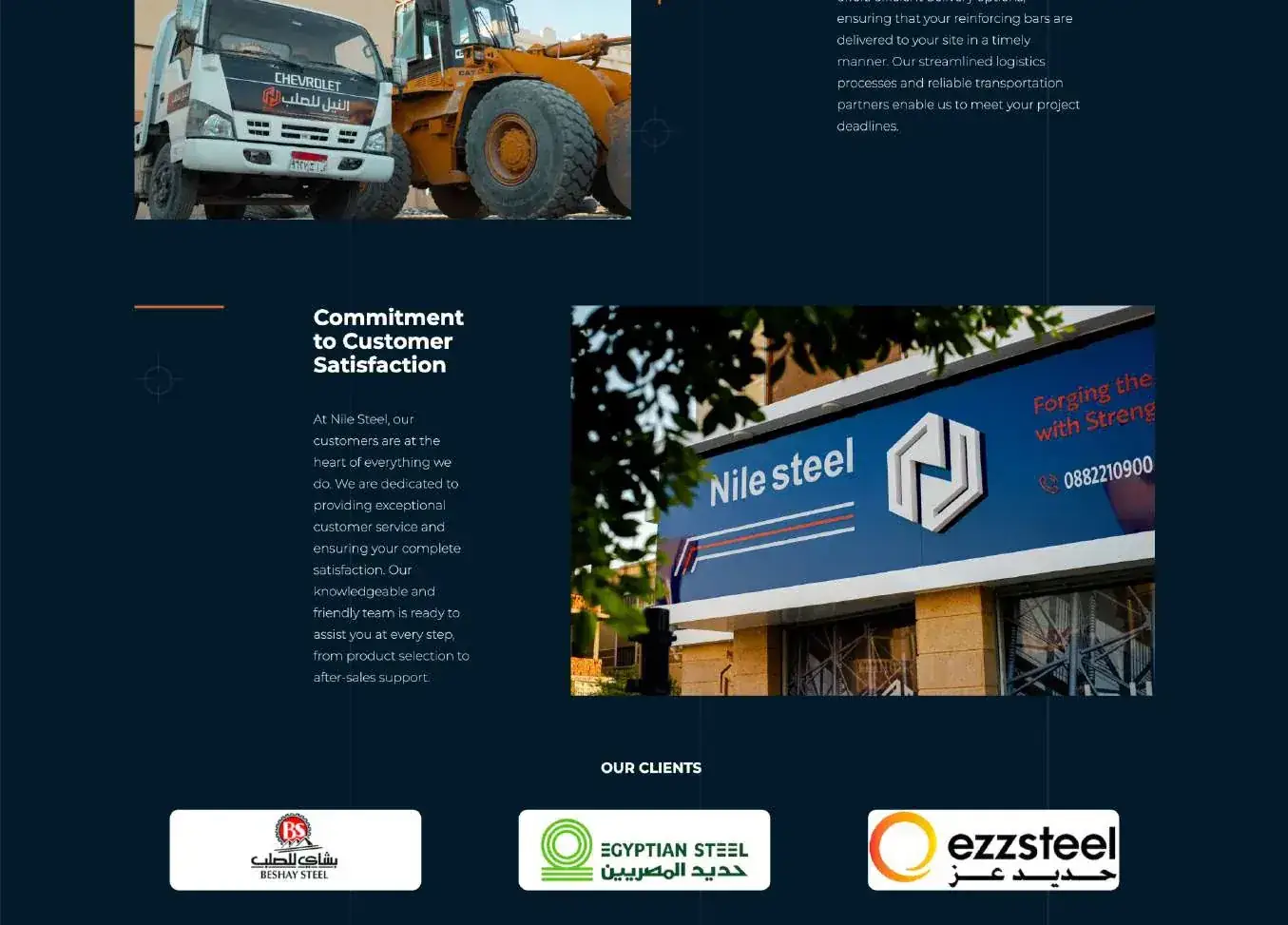
Nile Steel has supplied high-quality rebar to Egypt’s construction industry for 23 years, through branches across the country. We created their brand identity and their bilingual website.
The challenge
Rebar is a commodity: every mill promises strength. Nile Steel needed to look like the obvious choice for contractors and engineers, in Arabic first and English second.
The idea
A strong mark in deep navy and molten orange, with the Arabic and Latin names side by side. The website is Arabic-first, sets out the product range clearly, from 6 mm to 40 mm in grades Fe 415, Fe 500 and Fe 550, and makes it easy to get in touch.
Steel disappears once the building is finished. The brand has to be what people remember.
Logo
نيل and Nile, side by side, in one strong mark.


Colour
A palette with a purpose.
Typography
Alexandria on the website: one family that reads beautifully in Arabic and English.
Gallery
Highlights
Deliverables
- Logo (AR/EN)
- Brand identity
- Website, Arabic-first
Rusukh
View case study