Branding
Nodpet
Help your next landlord get to know your pet.

Overview
Nodpet helps UK renters build pet profiles with checked documents, training certificates and rental history, so landlords and letting agents have more to go on. We designed the identity and wrote it all down in a living guidelines site for everyone creating for Nodpet.
The challenge
Nodpet sits between two sides: renters tired of explaining the same things again and again, and cautious landlords. The brand had to feel warm to pet owners and credible to agents, and never promise an approval it can’t guarantee.
The idea
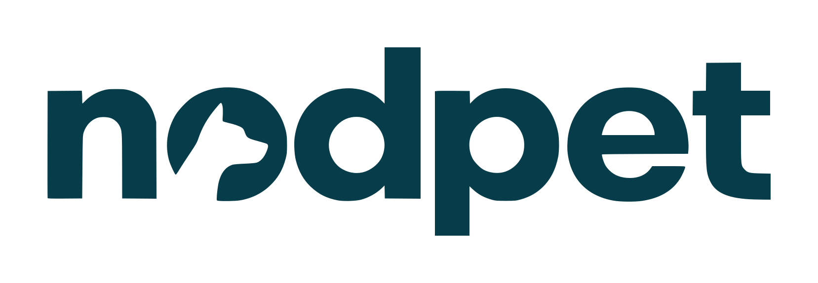
A wordmark where the dog stays in the name, with a matching icon for avatars and browser tabs. Two teals for structure, mist and warm cream for calm surfaces, and marigold for the one thing that needs attention. Manrope everywhere. A personality that is warm, direct and confident, with a little dry humour.
Landlords don’t say no to pets. They say no to uncertainty.
Logo
The dog stays in the name.

Colour
Cool foundations. A warm accent.
Typography
Manrope for headlines, body copy and product UI: one family, from the website to the app.
Voice
“Show what has been checked. Make missing information clear.”
“Never promise approval.”
Principles
Three rules behind every decision.
On the renter’s side
Understand the frustration. Give people useful help and a sensible next step.
Careful with the facts
Show what has been checked, make missing information clear, never promise approval.
Open to everyone
A first flat and a larger home deserve the same care.
Applications
The wordmark at work.
Gallery


Highlights
Deliverables
- Wordmark & icon
- Colour system
- Typography
- Tone of voice
- Brand guidelines website
Tuwā House
View case study