Branding
Premier Assistance
A P, a heart, a cross and a person, in one icon.

Overview
Premier Assistance provides healthcare assistance for individuals and businesses. We redefined their brand identity to communicate trust, care and efficiency.
The challenge
Healthcare brands tend to feel either cold and clinical or soft and vague. Premier needed to feel urgent and reliable, and caring at the same time.
The idea
One icon that carries four meanings: the letter p, a heart for care, a red cross for medical assistance, and a human figure for support. Red is kept for the heart and cross, where urgency belongs; everything else stays calm navy.
In a crisis, people don’t read. They recognise.
Colour
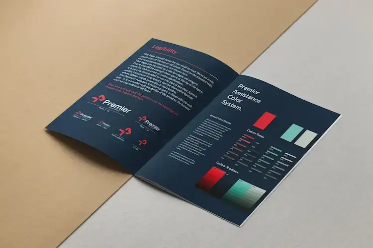
A palette with a purpose.
Gallery
Highlights
4meanings in one icon: P, heart, cross and person
Deliverables
- Icon & wordmark
- Colour system
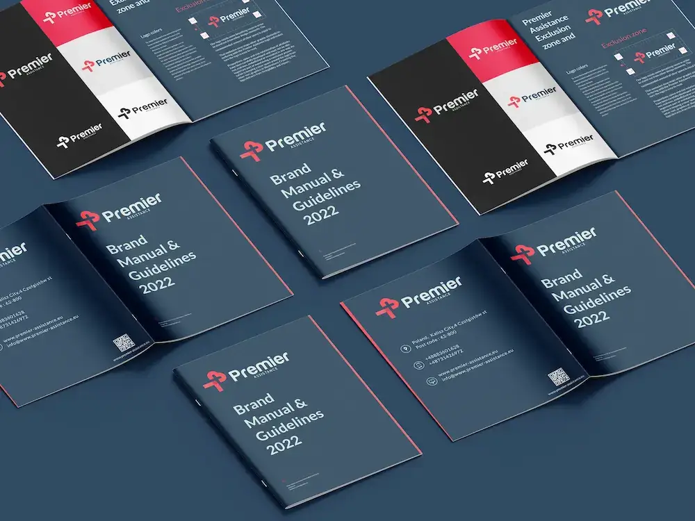
- Brand manual
Next project
Nile Steel
View case study